Style guide
The system as it stands, plus the calls still open. Sections marked Decided document what is already in use; they exist so choices stop drifting. Sections marked Open show real inconsistencies on the site today and need a pick.
Typography Decided
Archivo carries every heading, number and pull-quote. Body copy stays on the system sans, so the site loads one webfont family. Rule: a section heading never sets its own font-size; it takes .section-label and overrides margin only. Ignoring that is how four different heading sizes appeared last time.
Color Decided
Cool neutrals with terracotta held back. The accent is the one warm thing in the system and only works while it stays rare: a handful of marks per page, never on labels, field names or small rules.
--color-text
Headings, body, structural rules
--color-muted
Secondary copy, every micro-label
--color-border
Hairlines, outlined boxes
--color-rule
Structural rules needing more presence
--color-surface
Banded sections
--color-surface-deep
The one section that stands apart
--color-accent
Rationed — see below
Where terracotta is allowed
- The one emphasized word in the homepage headline
- Active states: nav item, filter tab, carousel dot
- Pull-quote borders and the oversized quote mark
- Numbered markers on Leadership and Principles
- The Impact stat on a case study card
- Link hover and focus states
Where it is not
- Micro-labels, field labels, eyebrows: all muted
- Small rules and dividers: these use --color-text
Color: warm neutral Open
Terracotta stays. The question this time is only the neutral undertone underneath it. Same accent hex on both sides below, so the comparison isolates cool vs. warm gray rather than mixing that question up with a new accent again.
Systems-level UX, built to hold without me.
Cool neutrals with the accent held back. It is the one warm thing in the system, and it stays rare.
What ships today. Neutrals lean slightly blue; terracotta reads as a clear warm departure from them, which is part of why it stands out as much as it does.
Systems-level UX, built to hold without me.
Cool neutrals with the accent held back. It is the one warm thing in the system, and it stays rare.
Neutrals shift toward stone instead of slate. Terracotta now sits closer in temperature to what's around it rather than cutting against it: quieter and more unified, at the cost of the accent popping less on sight.
Icons Decided
Heavy stroke, square caps, mitered joins, no corner radius, matched to the squared geometry and the bold display type. 2.25 stroke on a 24px grid, 1.75 on the 16px grid the inline parts use. All icons are inline SVG; there is no icon font anywhere in this theme.
Stat treatment Decided
Number first, label underneath, no rule. Ten different number treatments existed before this; most were already close to it, and the display sizes are now unified across Leadership stats, case study outcomes and launch signals. The rule-above variant is kept for the Leadership stats only; it reads well there, and using it everywhere is exactly how it would get worn out.
Value: Archivo 700 at clamp(1.75rem, 3vw, 2.25rem). Label: 0.75rem, 600, uppercase, muted.
Do not extend this to other stat groups without a reason. It earns its place on one page; repeated it becomes decoration.
Button Decided
Solid fill, square, weight 600, nudging 4px right on hover with the arrow traveling along its own axis. Still worth knowing: .btn is not currently used anywhere on the site; every call to action is a text link. The obvious place for it is the footer email action.
Hover it. Motion is wrapped in a prefers-reduced-motion guard, so the transform is dropped for anyone who has asked their system to reduce animation while the color change still fires; the state is never lost.
Arrows Decided
Two arrows, two meanings: the distinction carries information, so never swap one for the other on layout grounds. Each nudges along its own axis on hover, so the movement matches the direction the glyph points.
Case study cards, earlier-work rows, the principles cross-link, “See it in action”, “View all work”, “More on how I lead”. template-parts/icon-arrow.php
Email, LinkedIn, GitHub, ADPList, Instagram, Dribbble, the coffee link, Mentorship Resources. template-parts/icon-arrow-external.php
Links and focus Decided
Underlined at rest so links are findable without relying on color, terracotta on hover. Focus is a 2px accent outline at 3px offset; the site previously defined none at all, so keyboard users got whatever the browser drew.
Rules and dividers Decided
The hairline is the divider. A middle weight token existed with a single use and no clear job, so it was removed rather than left as a third option nobody could tell apart. The accent rule is a marker, not a divider: numbered items only.
--color-border — everywhere--color-accent, 3px — Leadership stats onlySpacing and layout Decided
Twenty-two different spacing values had crept into the stylesheet with no scale behind them. These are the ones worth keeping. Use a value from the scale rather than inventing a new one; that is how the drift started.
0.5rem
Label to the thing it labels
0.75rem
Inside a tight cluster
1rem
Between related lines
1.5rem
Between fields in a block
2rem
Between blocks
3rem
Grid gutters
4rem
Between components
6rem
Between major sections and bands
These look like drift and are not: each does a different job. Adding a fourth would be drift.
8.125rem 1frMarker column: a numeral and its rule. How I Lead, decision blocks.12rem 1frLabel column: a field name beside its value. About rows, the summary.18rem 1frSidebar column: a section heading beside its content. Bands, the split lead-in.72rem— the one container width, shared by every section including heroes42rem— prose measure. Applied to paragraphs, not to their container, so figures can use the full width48rem— the main breakpoint: two-column layouts collapse to one40rem— the small breakpoint: three-column grids collapse, label columns stack
Components Decided
The three most-repeated pieces, rendered with their real classes rather than mocked, so what is shown here is genuinely what ships.
-
Header Modernization
Reframing a fragmented navigation layer as a platform problem.
-
Locked case study
The whole card is one link; the corner glyph is the only affordance. Hover rotates -0.4deg and scales 1.012, the site’s oldest piece of motion, and what the button nudge was matched to. The locked variant swaps the arrow for a lock, drops the reframe line and the stat row, and a single password note renders above the grid rather than on every card.
Closes each decision block. Hairline border, no radius, micro-label, no accent; it follows the system, but it went through a near-black box and a terracotta-rule version first. It carries an unlocked-padlock mark. Deliberately not an arrow: the two arrows now mean internal and external navigation, and a third meaning would muddy them.
A: what is live. B: the same content in the “What it unlocked” box. The question is whether that box is a single-meaning device or a general callout pattern.
B makes the page more systematic: one bounded-callout pattern doing both jobs, with the label saying which job. It also matches the three boxes in the decisions above it, so the section reads as a bookend. The cost is the typographic drama: the principle stops being the largest thing on the page and becomes another line of body copy inside a box. A also keeps the box meaning one thing, the way the two arrows each mean one thing.
A surface nobody owned
Full-bleed, sits outside .container so it reaches the viewport edge.
Two tones only: --color-surface for the two ordinary bands, --color-surface-deep for the single section that has to stand apart. A third tone would flatten the distinction. Bands never sit directly against each other with white between them; that reads as an accident.
There’s too much going on and I don’t know where to start.
ParticipantB2C shopper, RITE testing
Terracotta left border and an oversized quote mark. One of the few places the accent is allowed, and one of the few treatments on this site that landed first time. Do not redesign it without a reason.
Images Decided
Defined before the real screenshots land rather than after, so they go in consistently. Case study imagery sits at container width, outside the 42rem prose measure so screenshots stay legible, and never full-bleed: the only edge-to-edge elements are the bands.
.cs-media wraps the image and caption. Images carry a hairline border so light screenshots do not bleed into the page. Placeholders use a dashed border, deliberately unlike every other box on the site, so an unfinished slot is never mistaken for a finished one.
Dimension Open
The site is flat on purpose: zero shadows or gradients anywhere in the stylesheet. Round one (a hard offset color panel, a bordered overlay card, a dot-grid texture) read as dated. Katie: "it just feels old school." Round two chases the same goal, depth, through more current means: overlap and scale contrast between photos, slight rotation, and a shadow soft enough to read as ambient rather than a UI effect. That last part is a real first for this stylesheet; see the note on option B.


A second, smaller photo overlaps the main one at a different scale, with just enough shadow to separate the two layers. Depth comes from the photos themselves rather than an added shape. This is the direction that scales down cleanly to two photos instead of three.
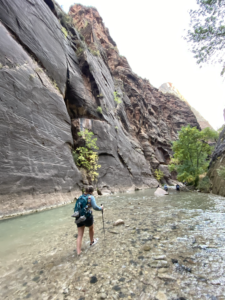
A slight rotation and a soft, wide, low-opacity shadow: ambient, not a hard drop shadow. This is the one real system change here: the site has zero box-shadow anywhere today, and this introduces the idea for the first time. It reads well as a single photo on its own, if Katie goes down to one on About rather than three.
No shadow, no rotation. Depth comes from breaking the equal-square grid: two different aspect ratios at two different vertical positions. The most conservative option relative to the flat, square-cornered system; the safest to say yes to without reopening other rules.
Keep exploring Decided
End of a case study: three compact cards to browse other work, rather than the page just ending. Deliberately not .case-study-card sized down: bordered box, title plus one client/date line, no reframe sentence, no stat row. Title-only was tried too; Katie picked title + client/date, so a name alone always has a little context. The heading is a quiet .more-work__label eyebrow, not .section-label: this section follows "How we worked" directly, and two bold headings in a row (one saying "worked", the other originally "work") read as an accidental echo rather than two real openers. The copy changed too, to "Keep exploring", for the same reason. Rendered with the real template part and classes, template-parts/more-work.php, so what is shown here is genuinely what ships.
Keep exploring
Editorial scale Open
A second reference Katie liked (garri.design/fintech), not for a specific device this time, but for its overall visual style: a lot more whitespace, a bigger type scale, and a problem statement set at headline size rather than body size. Two portable pieces of that, tried on real case study content.
The information wasn't missing from the page. It just wasn't visible at the moment someone actually needed it.
From Screen to Aisle's "gist": currently normal body copy inside the boxed summary. Set at headline scale instead, the closing line of the problem statement gets the same visual weight the reference gives its Challenge quote. This would sit alongside "The gist", not replace it; the box still carries Role/Scope/Client and the fuller paragraph.
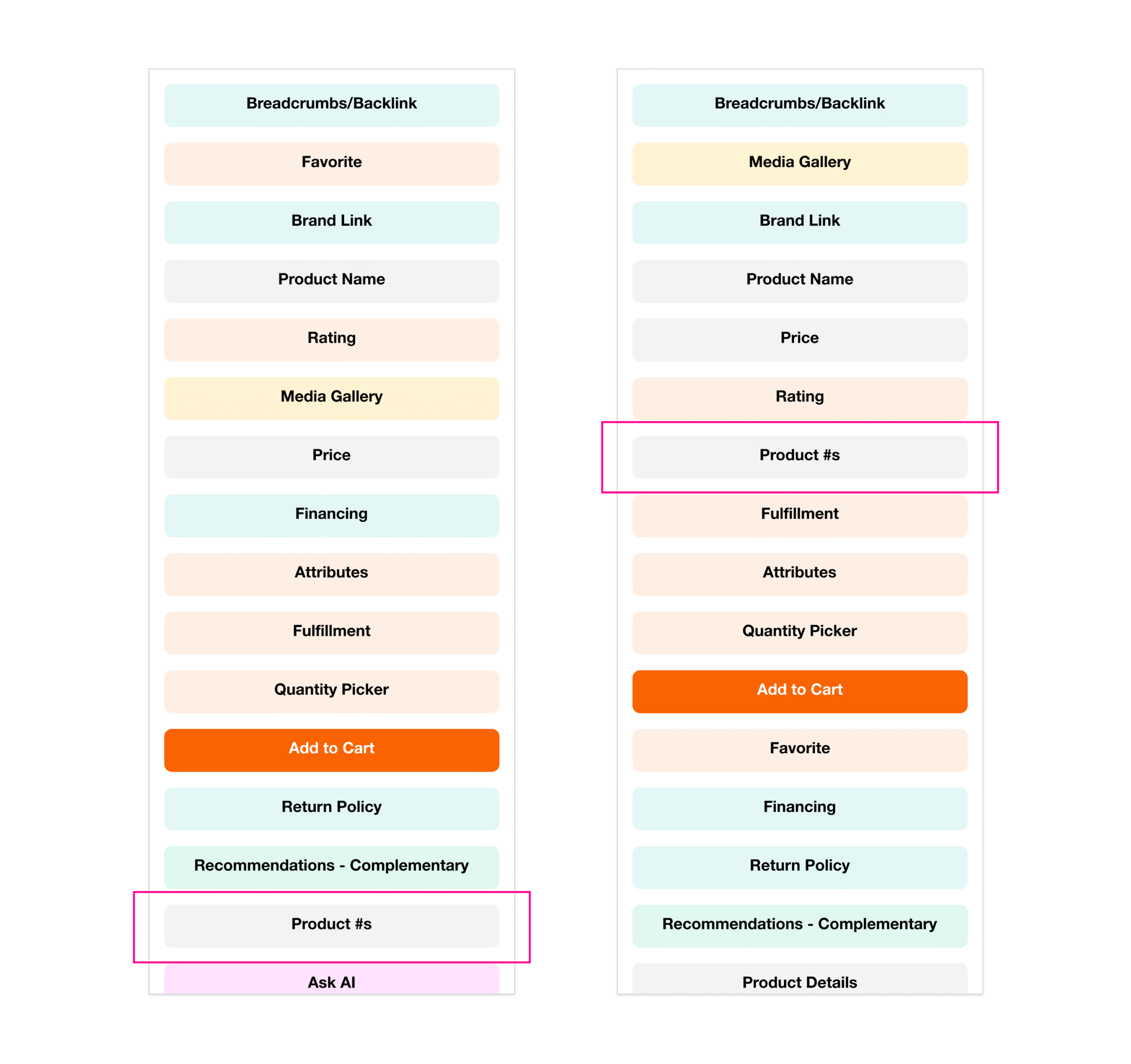
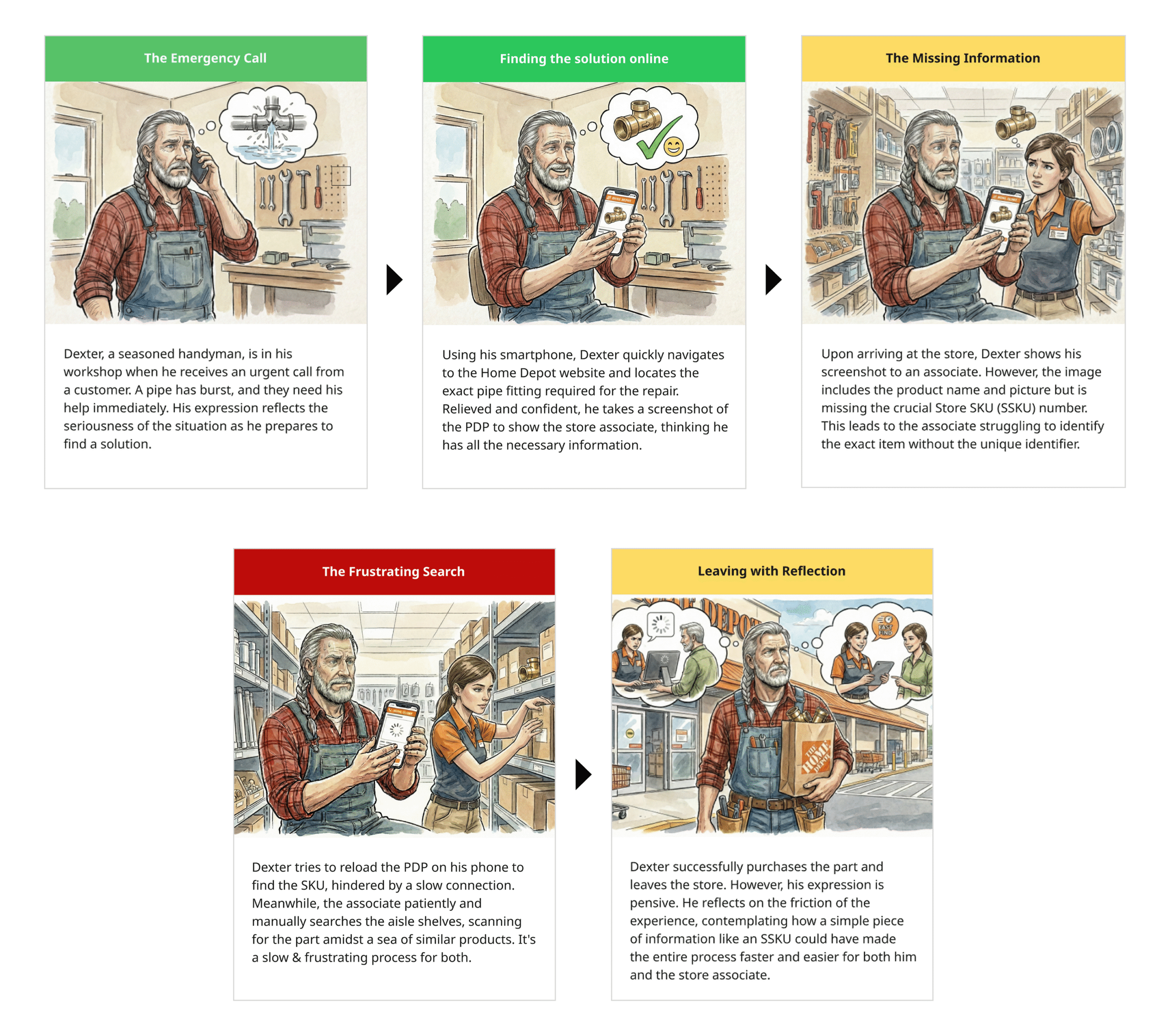
Same two Screen to Aisle screenshots, on a full-bleed soft-gray band with real air around them, instead of sitting directly on white inside a .cs-decision grid. Reads calmer and more considered with fewer images per page; the tradeoff is it asks for more vertical space than the current inline treatment.
I lead design that earns its place in the business.
Systems-level UX, cross-functional alignment, and measurable business impact, for enterprise products where design touches everything and belongs to no one team.
Katie, browsing garri.design's homepage separately: she likes how its hero fills most of the viewport rather than sitting in a normal-height band at the top. Same real headline and subline, same type styles, just given the room to breathe: roughly 80% of viewport height instead of a content-height band. Shown here at a fixed height rather than true viewport height so it fits the guide's flow; the real thing would use min-height: 80vh.
Voice and copy Decided
Unusual in a style guide, and the most re-litigated part of this site. These are rules found the hard way; with two more case studies to write, they are what stops the copy drifting back.
“I design outcomes, not just interfaces”
“I lead design that earns its place in the business”
A “not X” construction argues with a strawman before it says anything. Affirmative claims read as confident; corrective ones read as defensive.
“The system behind the screen”, “Consequential decisions”
“A surface nobody owned”, “Three calls that changed it”
Generic framework names are interchangeable between portfolios — which is exactly how this page ended up reading like someone else’s. A title that only describes your project cannot be borrowed.
CONTEXT / DECISION / TRADEOFF / EVIDENCE
THE SITUATION / THE CALL / WHAT IT COST / HOW I KNEW
Reusable across every case study so they read as one system. “What it cost” is the one that does the most work — most portfolios only show wins.
“Decision 01”, “Call 01”
“Move 01”
Borrowed from the How I Lead moves on the Leadership page, so the case studies speak the same language as the rest of the site.
“We aligned stakeholders and shipped”
“Merchandising lost prime real estate. Holding that meant arguing from data, repeatedly.”
Tradeoffs and the moment something nearly went wrong are the parts that read as seniority. The launch-pushback section is the strongest thing on the site for exactly this reason.
Accessibility Decided
Measured, not assumed. All three text colors clear AA for body text on white, but terracotta clears it by a small margin, which constrains what can be done with it later.
--color-text
18.96:1
Passes AA and AAA
--color-muted
5.05:1
Passes AA for body text
--color-accent
4.87:1
Passes AA — but only just. Do not lighten it, and do not put it on a tinted band without re-checking.
- Focus is a 2px accent outline at 3px offset, defined globally. Never remove it without replacing it.
- All motion sits behind a prefers-reduced-motion guard; color changes still fire, so no state depends on movement alone.
- One H1 per page. Work has two headings at the same visual size: the second is an H2 carrying .page-heading, which is how they match without breaking the outline.
- Anything that looks like a heading must be a heading. A styled span was caught doing this job once already.
- Decorative marks (rules, quote glyphs, arrows) carry aria-hidden. Icons that are the only affordance sit inside a link with real text.