Papa John's · 2019
Checkout & Apple Pay
Consolidating a multi-step checkout into one screen, and giving Apple Pay equal footing with a credit card.
Checkout was three screens deep, gated in an order that matched how the backend was built rather than what people actually wanted first. The fix consolidated it into one page and gave Apple Pay the same visual weight as a credit card.
Attributed to the checkout overhaul and Apple Pay's introduction.
Order the page around what people ranked first, not what the backend needed first
The existing flow gated people through contact information, then payment, then delivery details, one screen at a time, an order that matched how the screens had always been built, not what someone deciding between pickup and delivery actually cared about first.
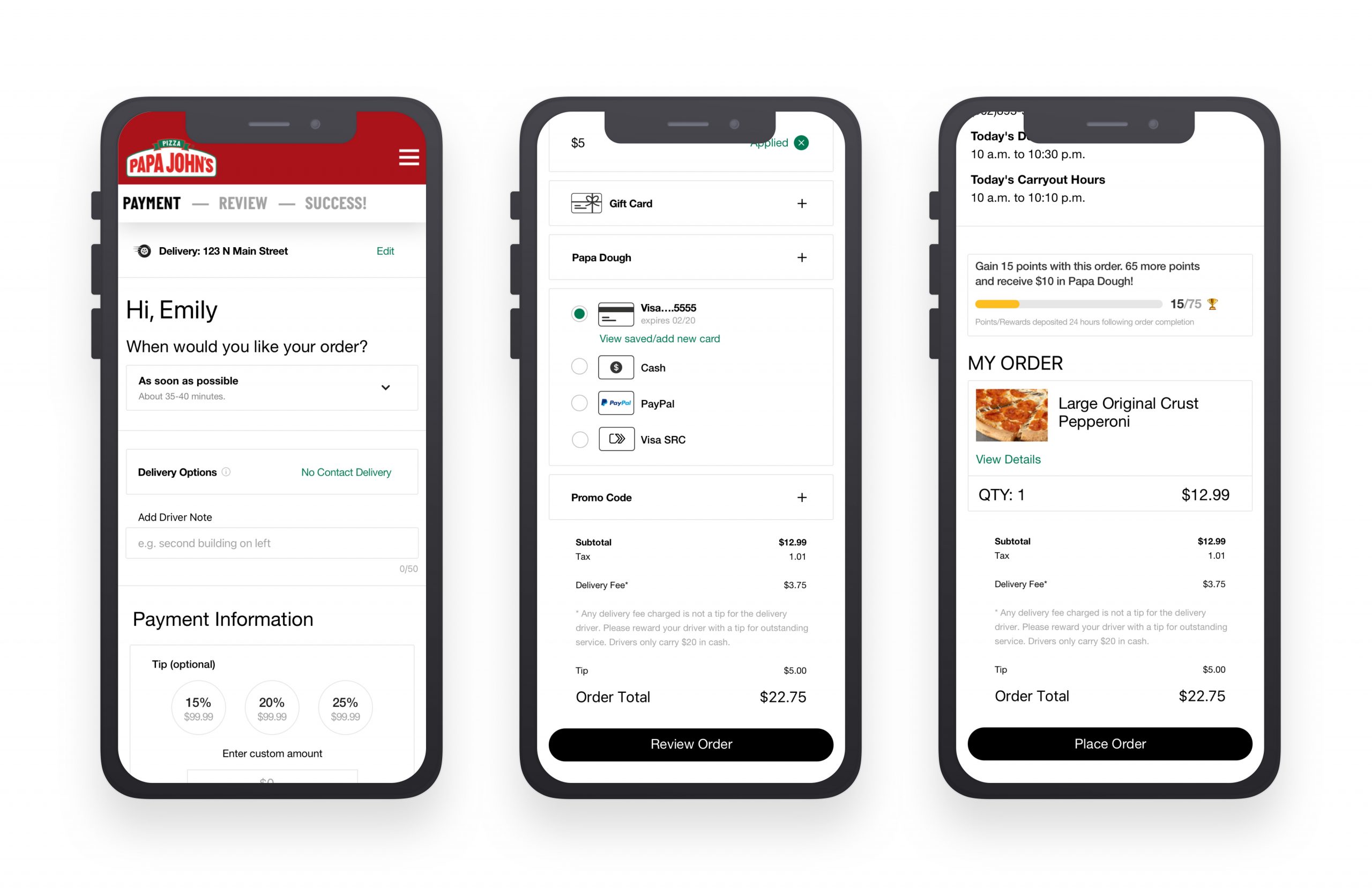
Asked people to rank the checkout steps by importance before redesigning anything. The order that came back (when will it arrive, delivery or pickup, how do I pay, review the order) was nearly the reverse of the shipped sequence, so the new page laid every section out in that order instead of paginating through it.
The reassurance of a numbered flow (Payment, Review, Success), which a single scrolling screen had to earn back through section headers instead of steps.
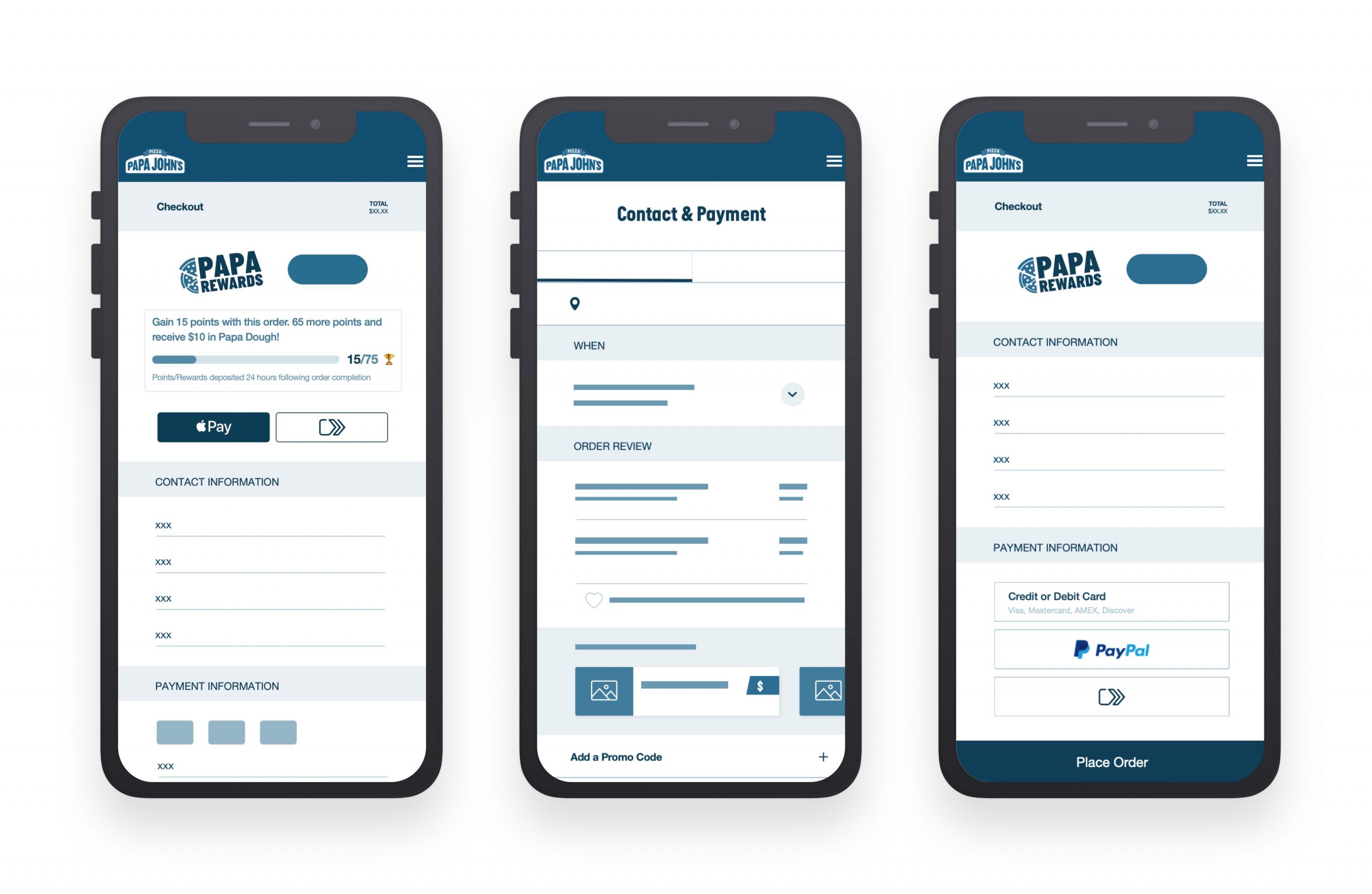
Give mobile payment the same footing as a card
Apple Pay and Google Pay already existed in the build, but sat below the fold at the same visual size as a text link. Concept testing said people defaulted to typing in a card number anyway, phone wallet or not, because nothing on the screen suggested the shortcut was there.
Gave the one-tap options equal size and top billing in the payment list instead of a footnote, and exposed the promo-code and gift-card fields directly on the page instead of behind a dropdown toggle: don’t hide something that costs nothing to show, applied to money as much as to payment method.
Rebuilding the payment module’s hierarchy from the ground up. A blank credit-card field had always been the default, largest element on the screen; changing that changed the first thing every user saw, not just the ones who wanted the shortcut.
Looking back
The ranking exercise came after the three-screen checkout was already live, not before it was built; worth running earlier next time, so a mismatched step order gets caught before there's a shipped flow to unwind. Moving Apple Pay to equal footing helped the customers who already knew it was an option; the slower win was teaching everyone else that it was there at all, which took longer than shipping the button did.